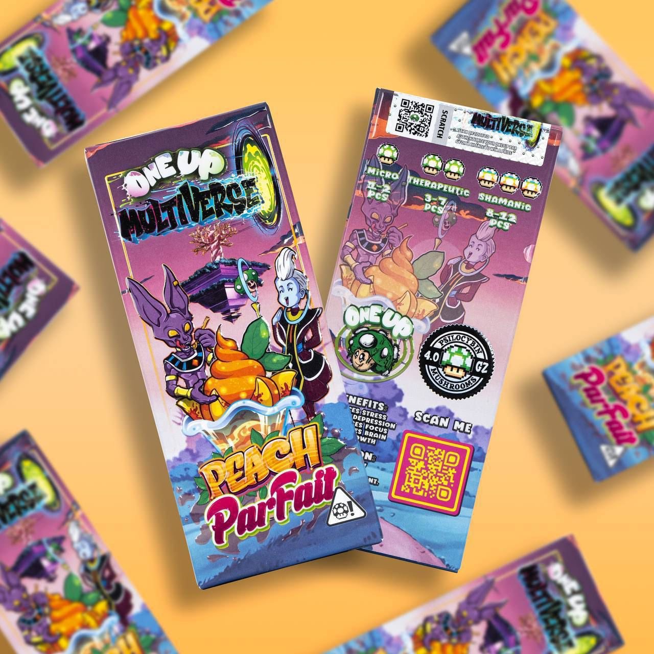
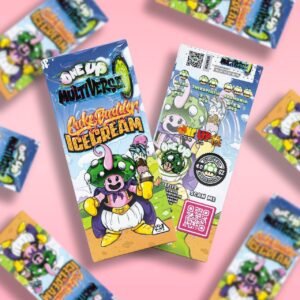
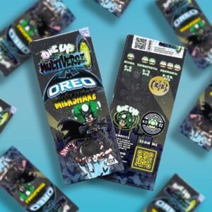
The One Up Multiverse Oreo Milkshake packaging features a bold, colourful design inspired by comic-book and fantasy aesthetics. The front of the package prominently displays the “One Up Multiverse” branding alongside a large Oreo Milkshake flavour designation. The artwork combines dark cosmic backgrounds, vivid green accents, graphic illustrations and playful superhero-inspired imagery to create a distinctive visual identity.
The packaging uses a predominantly black and dark-grey background, contrasted with bright white, blue, yellow and green lettering. A large Oreo-style cookie illustration is positioned toward the lower portion of the front panel, surrounded by milkshake-inspired visual elements. The combination of the cookie imagery and the “Milkshake” wording makes the intended flavour theme immediately recognizable.
A superhero-inspired character occupies a significant part of the front artwork, giving the package a playful comic-book appearance. Additional graphic elements, including stars, abstract shapes and illustrated details, contribute to the overall “multiverse” theme. The design is highly visual and intended to stand out on a shelf or within a product display.
The reverse side continues the same dark, illustrated aesthetic and includes multiple printed sections and graphic symbols. It features QR-code areas, branding elements and various small illustrated icons arranged across the upper and middle portions of the package. The rear panel also contains printed wording and product-related information, although some of the smaller text is difficult to read clearly from the photograph.
The package has a rectangular box-style presentation with a glossy-looking printed surface. Its front and back panels use coordinated artwork so that the product maintains a consistent appearance from different viewing angles. The bright colours against the dark background give the packaging a strong contrast and make the main branding and flavour text particularly prominent.
From a design perspective, the product combines several recognizable visual themes: cookies and cream, milkshake imagery, comic-book illustration, space/cosmic graphics and superhero-style artwork. These elements create a distinctive and youthful-looking package rather than a minimalist or traditional food-package design.
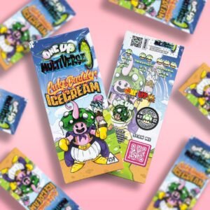
The photograph also shows additional packages positioned around the main product against a bright blue background. This creates a promotional-style product photography setup while keeping the featured package clearly visible in the centre of the image.
Overall, the One Up Multiverse Oreo Milkshake package is characterized by its striking comic-inspired artwork, dark cosmic background, bright typography, Oreo-themed imagery and detailed illustrated graphics. The front panel is designed around immediate visual recognition of the brand and flavour theme, while the reverse provides additional printed information, graphic elements and QR-code sections.
For an online catalogue, the product can therefore be described primarily in terms of its packaging design, flavour-themed artwork, branding, colour scheme and physical presentation, without making unverified claims about ingredients, effects, potency or health benefits.
Be the first to review “The One Up Multiverse Oreo Milkshake”
Related products

Reviews
There are no reviews yet.